
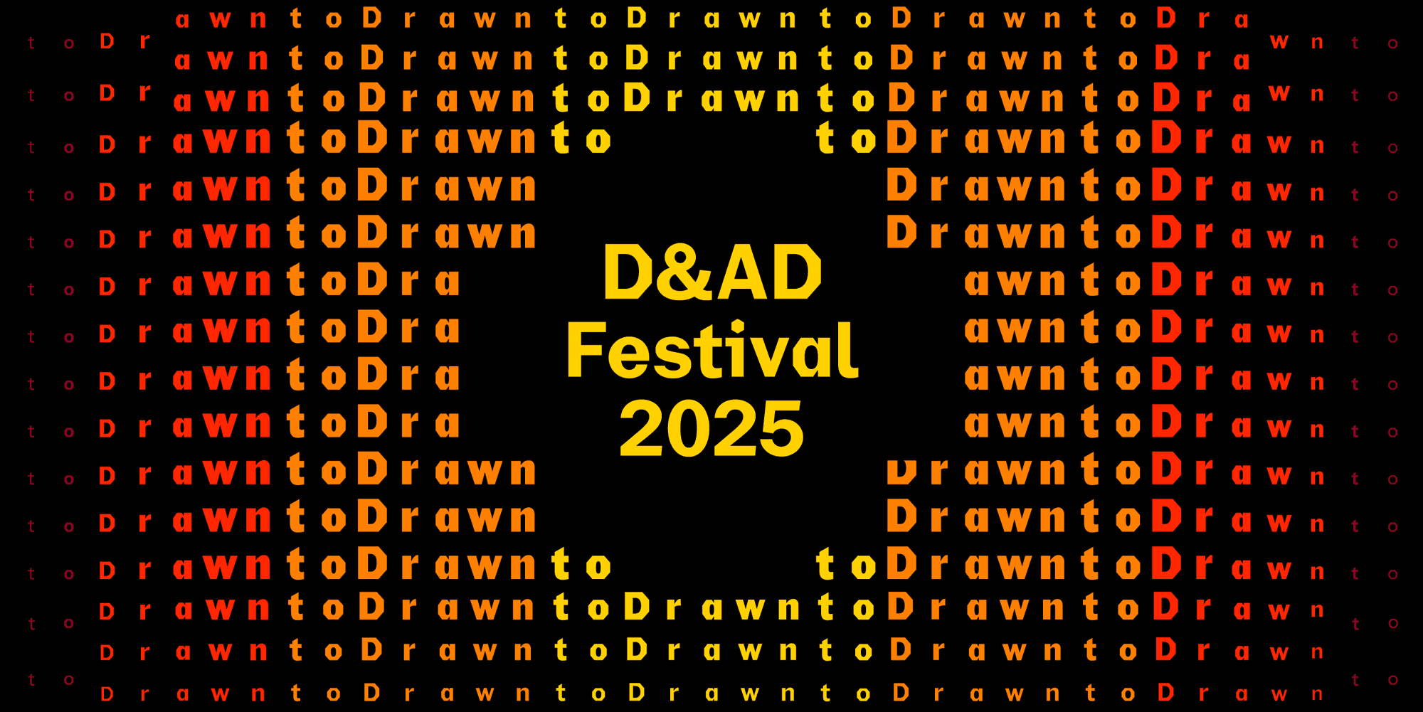
D&AD Festival 2025: Same Shade of Purple. One Made Money. The Other Was Jaguar.
Inspiration
•
May 22, 2025

When a dying car brand does better brand strategy than the world’s biggest tech company, we kinda have a problem.
I came to D&AD Festival 2025 for a ruthless masterclass in gorgeous design and million-pound strategy served by OpenAI x Studio Dumbar. Instead, a boomer French car brand slapped me in the face with a baguette and reminded me what Branding is there to do.
The Talk I Wanted To Love But Instantly Regretted
I came to D&AD Festival, Day 1, ready to be humbled by creative genius. Studio Dumbar. OpenAI. This had to be the rebranding case study of the decade. Big motion design. Big tech. Big budget. COLOSSAL expectations.
I thought: “Finally, some top-tier strategic thinking, a philosophical lecture in restraint with substance. Not just taste, but clarity. Not just beautiful design, but the epitome of creative direction in 2025”.
Instead, I got a dot.
They took the good ol’ OpenAI “blossom” symbol, removed any reference to a “we come in peace and are not-for-profit” hippie flower, and decided a dot had enough strategic gravitas to carry an entire identity system. A literal dot.
Let that sink in.


I see dead circles
You’d think: “Bold choice! Massive sobriety! An ode to minimalism!”
But then they explained how they simplified the blossom into a circle, and then made that circle the whole brand system, and that was basically it. Approved. Shipped.
They just reverse-engineered some design astrology about how the hexagon in the blossom represented technology and its roundness meant Humanity.
Nice try, Diddy.
Liza Enebeis, probs one of the biggest creative director goddesses of this century, sorta slipped her tongue and said something around the lines of:
“The brand’s visual identity was so simple that it needed motion and sound design to make it feel like something”.
Which is a WILD thing to admit out loud at a design festival. That your brand doesn’t communicate until it moves. Go. F*cking. figure.
Insanely beautiful work.
Completely hollow.
I was so ready to tear it apart.
But hey, too easy 😉
Renault, of all brands on this planet, had already done what I was expecting from this event. And I don’t even know how to drive.
Reverse Hype > Hype
Just before the OpenAI nothing-burger I had waited months to experience, 2 French gentlemen got on stage and did what no one else at D&AD managed: They told the f*cking truth.
One was the new CMO of Renault. The other, the Creative Director from Publicis Conseil France. Thick accents. Spilling jokes about their ADHDs and a rogue fly on the stage making them lose focus.
And more strategic clarity in 5 minutes than the entire Festival Day 1 combined.
“When I joined Renault, we were bleeding millions a day. Most CMOs would have blamed and fired the agency. I didn’t.”
They didn’t throw everything out the window and rebranded for clout or a cute pencil-trophy. They stuck together, like proper partners, and did the one thing that most branding studios these days seem deathly allergic to:
They did The Work™.
5 freakin’ years of it.
Not “moodboarding the future” work.
Not “elevating the narrative” work.
Actual, old-school, sleeves-rolled-up, reality-based, strategic business transformation.
They started with a 3-year EV pilot in Appy (cute!), the most middle-of-nowhere village in France, just to prove that EVs could work where the infrastructure didn’t.
No Parisian glamour.
They built Plug Inn: a community-powered EV charging app, to solve the actual problem of range anxiety in rural regions. It took them 2 years of dev time.
They didn’t invent a story. They didn’t position themselves as saviours of the rural blue collars. They just looked at what they were already doing (like microcredit for low-income households) and used that as the foundation for a brilliant rebrand and ad campaign.
The outcome?
🥖 A Brand with capital B of Baguette that made sense.
Design that had context brought by Renault’s internal design team + Landor.
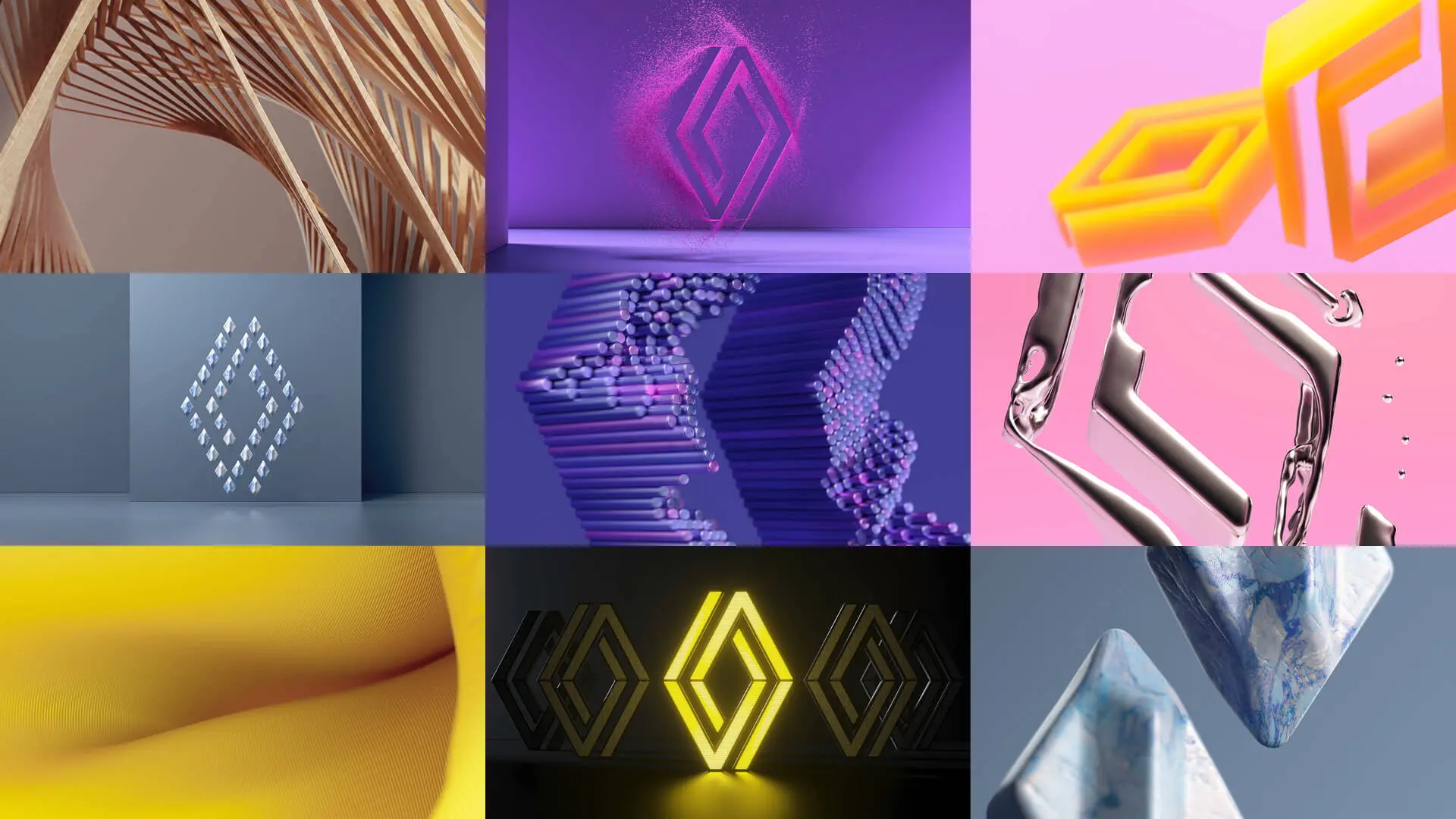
ALSO gorgeous motion porn brought by ManVsMachine.
But a product people actually needed, positioned for people who actually exist.
Not persona templates.
Not user archetypes.
Not Gen Z billionaires in Shenzhen who drool over Labubus instead of giving a f*ck about parallel parking.
BUT WAIT. Renault did the EXACT same thing as Jaguar and…won?
I was sitting there, nodding at Renault’s case study, taking notes: Purple glow. Yup. Retro logo. Aha. Clean sans serif…
And I thought…Bruv. Hold your horses and panthers.
🤔 Isn’t this a MASSIVE lookalike of the rebrand Jaguar did like last January or whatever?
Same nostalgic nods.
Same sleek-but-not-really system.
Same colour palette.
Same soft futurism pulled from the ‘modern heritage’ starter pack.
Why is Renault printing money with a visual identity that looks nearly identical to Jaguar’s?
Why did one take off and the other flatline…violently?
Same aesthetic.
Same category.
Same “let’s make the old new again” approach.
Renault is slaying.
Jaguar is dying.
SO… It wasn’t the visuals.
That much was clear.
It HAD TO BE what sat underneath them, then.
Let’s talk about THAT.
Find the 5 differences
Renault And Jaguar Had The Same Brief
Legacy car brand. Losing relevance. New EVs. Bring back the heritage, but make it cool. Use nostalgia, but don’t make it look like a reboot. Make it minimal. Make it PURPLE.
Same aesthetic.
Same goal.
Same design playbook.
But Renault did the work with ✨ care ✨.
Jaguar slapped a vibe and called it a day.
Renault built a product that solved a problem. Then they used strategic branding to bring that product to the people who needed it most.
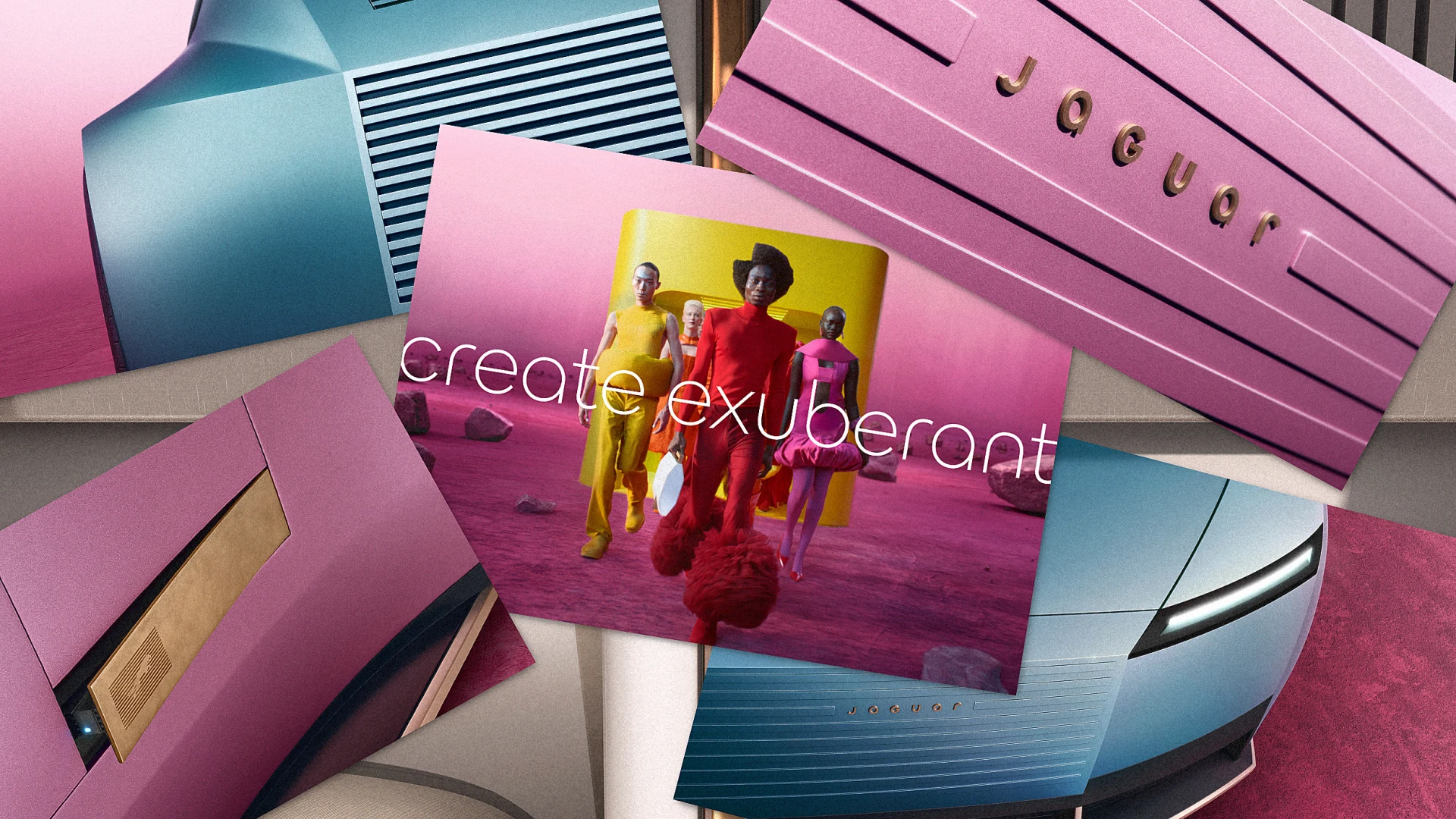
Jaguar didn’t start with anything. They didn’t revisit their audience. They didn’t adapt their classics. They didn’t even speak to the people who kept them fed for decades.
They just threw on a new logo on a lineup of cars no one asked for and went hunting for Gen Z in China; a market that doesn’t know them, doesn’t care, and doesn’t need another car brand performing cool and landing in cringe-ville.
Or a market that even exists!?
Still f*cking alien to me that Gen Z has the disposable income to blow on a concept-car cosplay.
Renault used a rebrand to communicate real transformation.
Brought back the Twingo, but now it’s sexy.
Jaguar used a rebrand to cover up the lack of a freakin’ clue.
Bubu-Winky™ will save us all
The Work Takes Work. And No One’s Doing It.
The real punchline here isn’t Jaguar’s pathetic boomer attempt at skibidi.
It’s the entire branding industry.
It’s 2025 and branding agencies are still out here dropping £150K++++ rebrands with zero strategy. Just look and feel. Just custom typefaces. Just motion porn.
Just some design logic reverse-engineered to sound clever in a case study, win a pencil, high-five themselves backstage while fully knowing in their consciences that:
There was no real research.
There was no behavioural insight.
There was only a deck built in 2 days, dead eyes, and a tagline about “rediscovering soul” regurgitated by an intern.
And why? Because the work is HARD.
*Actually* thinking is hard.
*Actually* listening is hard.
Sitting with messy, bleeding businesses and building something useful is f*cking hard.
So agencies now just skip it.
They chase aesthetics because it’s faster. Because it looks good on socials. Because it sells to founders who want to look “premium” by last Friday.
And yet it took Publicis, a big old dinosaur of an AD agency, to show an entire room of creatives what branding truly is.
2 French guys.
1 business in the gutter.
5 years of real, tough decisions.
No egos. Just men (surprisingly) behaving like grown ups, like partners and not enemies, building something with real positive consequences in this sad, sad world.
They didn’t fake a strategy.
They started with Humans.
With problems.
And the branding came after.
As it should.
Because branding is not the product.
Branding is how people GET to the product.
It’s the BRIDGE.
And if you haven’t built the thing with your bare hands and sweat, if there’s no clarity, no story, no use, no need, then the bridge is just floating in midair and IT. WILL. COLLAPSE.
Just by gravity alone.
Jaguar faked a foundation.
Most agencies are still doing it for their clients on the daily.
Renault didn’t.
And that’s why it worked.
Just give them the f*cking pencil already.
_____
With 🧡💜🖤 from the middle-stack,
Esther from Singularity
💌 Hate mail here: esther@singularity.uk.com
📚 The Clickbait™ Substack here: theclickbait.substack.com
Related insights


D&AD Festival 2025: Same Shade of Purple. One Made Money. The Other Was Jaguar.
Inspiration
•
May 22, 2025
When a dying car brand does better brand strategy than the world’s biggest tech company, we kinda have a problem.
I came to D&AD Festival 2025 for a ruthless masterclass in gorgeous design and million-pound strategy served by OpenAI x Studio Dumbar. Instead, a boomer French car brand slapped me in the face with a baguette and reminded me what Branding is there to do.
The Talk I Wanted To Love But Instantly Regretted
I came to D&AD Festival, Day 1, ready to be humbled by creative genius. Studio Dumbar. OpenAI. This had to be the rebranding case study of the decade. Big motion design. Big tech. Big budget. COLOSSAL expectations.
I thought: “Finally, some top-tier strategic thinking, a philosophical lecture in restraint with substance. Not just taste, but clarity. Not just beautiful design, but the epitome of creative direction in 2025”.
Instead, I got a dot.
They took the good ol’ OpenAI “blossom” symbol, removed any reference to a “we come in peace and are not-for-profit” hippie flower, and decided a dot had enough strategic gravitas to carry an entire identity system. A literal dot.
Let that sink in.
I see dead circles
You’d think: “Bold choice! Massive sobriety! An ode to minimalism!”
But then they explained how they simplified the blossom into a circle, and then made that circle the whole brand system, and that was basically it. Approved. Shipped.
They just reverse-engineered some design astrology about how the hexagon in the blossom represented technology and its roundness meant Humanity.
Nice try, Diddy.
Liza Enebeis, probs one of the biggest creative director goddesses of this century, sorta slipped her tongue and said something around the lines of:
“The brand’s visual identity was so simple that it needed motion and sound design to make it feel like something”.
Which is a WILD thing to admit out loud at a design festival. That your brand doesn’t communicate until it moves. Go. F*cking. figure.
Insanely beautiful work.
Completely hollow.
I was so ready to tear it apart.
But hey, too easy 😉
Renault, of all brands on this planet, had already done what I was expecting from this event. And I don’t even know how to drive.
Reverse Hype > Hype
Just before the OpenAI nothing-burger I had waited months to experience, 2 French gentlemen got on stage and did what no one else at D&AD managed: They told the f*cking truth.
One was the new CMO of Renault. The other, the Creative Director from Publicis Conseil France. Thick accents. Spilling jokes about their ADHDs and a rogue fly on the stage making them lose focus.
And more strategic clarity in 5 minutes than the entire Festival Day 1 combined.
“When I joined Renault, we were bleeding millions a day. Most CMOs would have blamed and fired the agency. I didn’t.”
They didn’t throw everything out the window and rebranded for clout or a cute pencil-trophy. They stuck together, like proper partners, and did the one thing that most branding studios these days seem deathly allergic to:
They did The Work™.
5 freakin’ years of it.
Not “moodboarding the future” work.
Not “elevating the narrative” work.
Actual, old-school, sleeves-rolled-up, reality-based, strategic business transformation.
They started with a 3-year EV pilot in Appy (cute!), the most middle-of-nowhere village in France, just to prove that EVs could work where the infrastructure didn’t.
No Parisian glamour.
They built Plug Inn: a community-powered EV charging app, to solve the actual problem of range anxiety in rural regions. It took them 2 years of dev time.
They didn’t invent a story. They didn’t position themselves as saviours of the rural blue collars. They just looked at what they were already doing (like microcredit for low-income households) and used that as the foundation for a brilliant rebrand and ad campaign.
The outcome?
🥖 A Brand with capital B of Baguette that made sense.
Design that had context brought by Renault’s internal design team + Landor.
ALSO gorgeous motion porn brought by ManVsMachine.
But a product people actually needed, positioned for people who actually exist.
Not persona templates.
Not user archetypes.
Not Gen Z billionaires in Shenzhen who drool over Labubus instead of giving a f*ck about parallel parking.
BUT WAIT. Renault did the EXACT same thing as Jaguar and…won?
I was sitting there, nodding at Renault’s case study, taking notes: Purple glow. Yup. Retro logo. Aha. Clean sans serif…
And I thought…Bruv. Hold your horses and panthers.
🤔 Isn’t this a MASSIVE lookalike of the rebrand Jaguar did like last January or whatever?
Same nostalgic nods.
Same sleek-but-not-really system.
Same colour palette.
Same soft futurism pulled from the ‘modern heritage’ starter pack.
Why is Renault printing money with a visual identity that looks nearly identical to Jaguar’s?
Why did one take off and the other flatline…violently?
Same aesthetic.
Same category.
Same “let’s make the old new again” approach.
Renault is slaying.
Jaguar is dying.
SO… It wasn’t the visuals.
That much was clear.
It HAD TO BE what sat underneath them, then.
Let’s talk about THAT.
Find the 5 differences
Renault And Jaguar Had The Same Brief
Legacy car brand. Losing relevance. New EVs. Bring back the heritage, but make it cool. Use nostalgia, but don’t make it look like a reboot. Make it minimal. Make it PURPLE.
Same aesthetic.
Same goal.
Same design playbook.
But Renault did the work with ✨ care ✨.
Jaguar slapped a vibe and called it a day.
Renault built a product that solved a problem. Then they used strategic branding to bring that product to the people who needed it most.
Jaguar didn’t start with anything. They didn’t revisit their audience. They didn’t adapt their classics. They didn’t even speak to the people who kept them fed for decades.
They just threw on a new logo on a lineup of cars no one asked for and went hunting for Gen Z in China; a market that doesn’t know them, doesn’t care, and doesn’t need another car brand performing cool and landing in cringe-ville.
Or a market that even exists!?
Still f*cking alien to me that Gen Z has the disposable income to blow on a concept-car cosplay.
Renault used a rebrand to communicate real transformation.
Brought back the Twingo, but now it’s sexy.
Jaguar used a rebrand to cover up the lack of a freakin’ clue.
Bubu-Winky™ will save us all
The Work Takes Work. And No One’s Doing It.
The real punchline here isn’t Jaguar’s pathetic boomer attempt at skibidi.
It’s the entire branding industry.
It’s 2025 and branding agencies are still out here dropping £150K++++ rebrands with zero strategy. Just look and feel. Just custom typefaces. Just motion porn.
Just some design logic reverse-engineered to sound clever in a case study, win a pencil, high-five themselves backstage while fully knowing in their consciences that:
There was no real research.
There was no behavioural insight.
There was only a deck built in 2 days, dead eyes, and a tagline about “rediscovering soul” regurgitated by an intern.
And why? Because the work is HARD.
*Actually* thinking is hard.
*Actually* listening is hard.
Sitting with messy, bleeding businesses and building something useful is f*cking hard.
So agencies now just skip it.
They chase aesthetics because it’s faster. Because it looks good on socials. Because it sells to founders who want to look “premium” by last Friday.
And yet it took Publicis, a big old dinosaur of an AD agency, to show an entire room of creatives what branding truly is.
2 French guys.
1 business in the gutter.
5 years of real, tough decisions.
No egos. Just men (surprisingly) behaving like grown ups, like partners and not enemies, building something with real positive consequences in this sad, sad world.
They didn’t fake a strategy.
They started with Humans.
With problems.
And the branding came after.
As it should.
Because branding is not the product.
Branding is how people GET to the product.
It’s the BRIDGE.
And if you haven’t built the thing with your bare hands and sweat, if there’s no clarity, no story, no use, no need, then the bridge is just floating in midair and IT. WILL. COLLAPSE.
Just by gravity alone.
Jaguar faked a foundation.
Most agencies are still doing it for their clients on the daily.
Renault didn’t.
And that’s why it worked.
Just give them the f*cking pencil already.
_____
With 🧡💜🖤 from the middle-stack,
Esther from Singularity
💌 Hate mail here: esther@singularity.uk.com
📚 The Clickbait™ Substack here: theclickbait.substack.com